Sharing stories through
VISUAL DESIGN

Using data + insights
as the brush strokes
for my designs.
Sharing stories through
Using data + insights
as the brush strokes
for my designs.
I value simplicity, purpose, and impact. My creativity is structured with
value-based decisions to maximize the targeted audience's experience.
Creating for UC Irvine taught me how to innovate within strict branding guidelines, excel with multiple assignments at once, oversee video projects, and communicate expectations during various promotion campaigns.
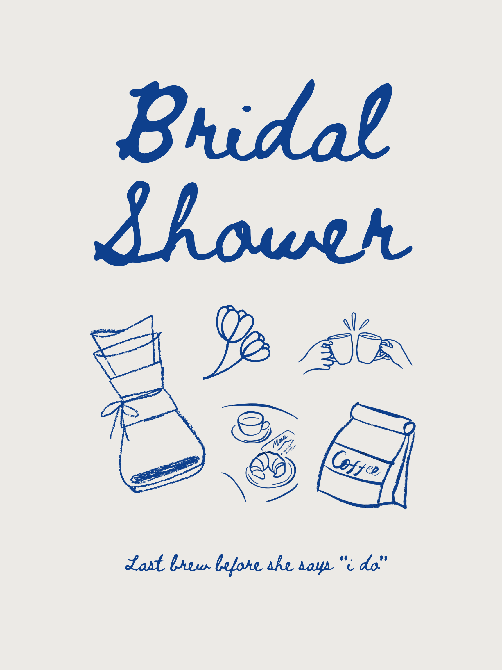
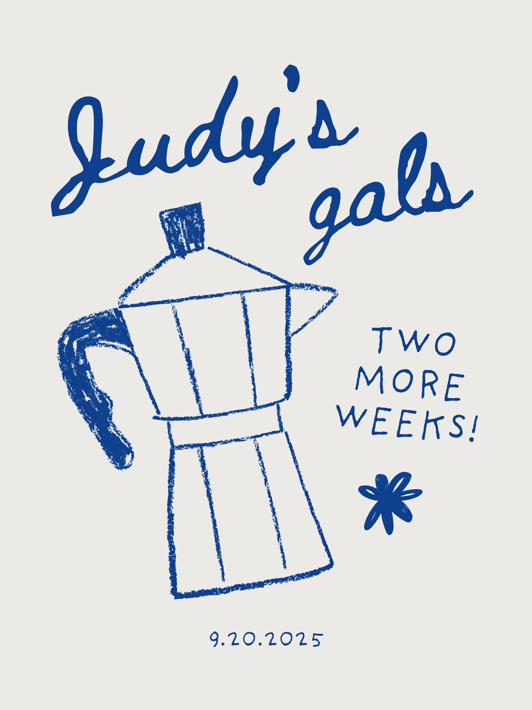
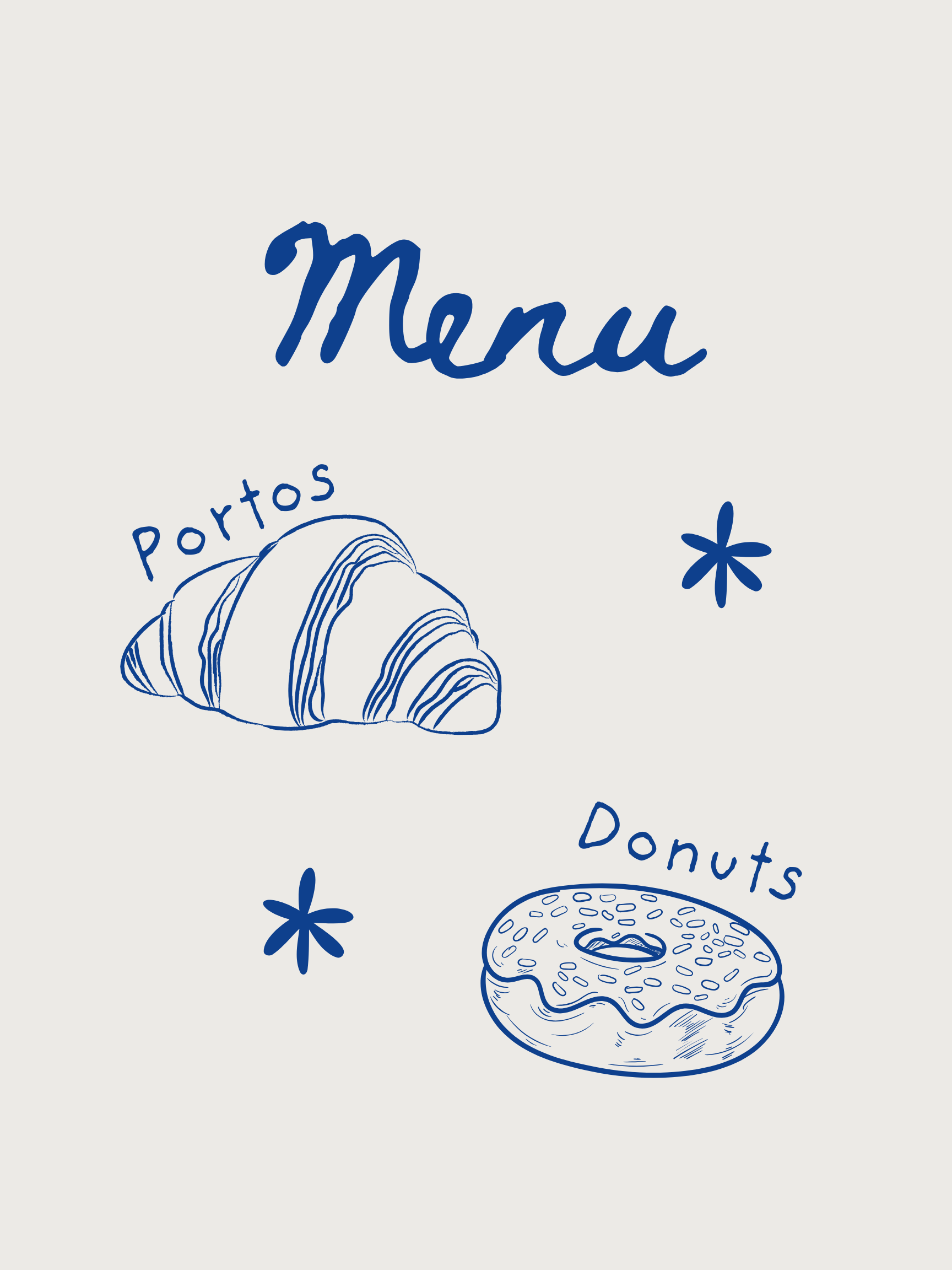
This bridal shower's theme was inspired by the at-home-cafe trend, and the event included pastries, coffee, and good vibes. The bride wanted three posters to hang on the wall for a fun, casual atmosphere.
I carried out this playful theme with a hand-drawn aesthetic.

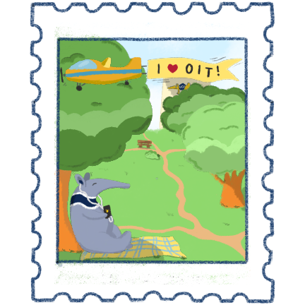
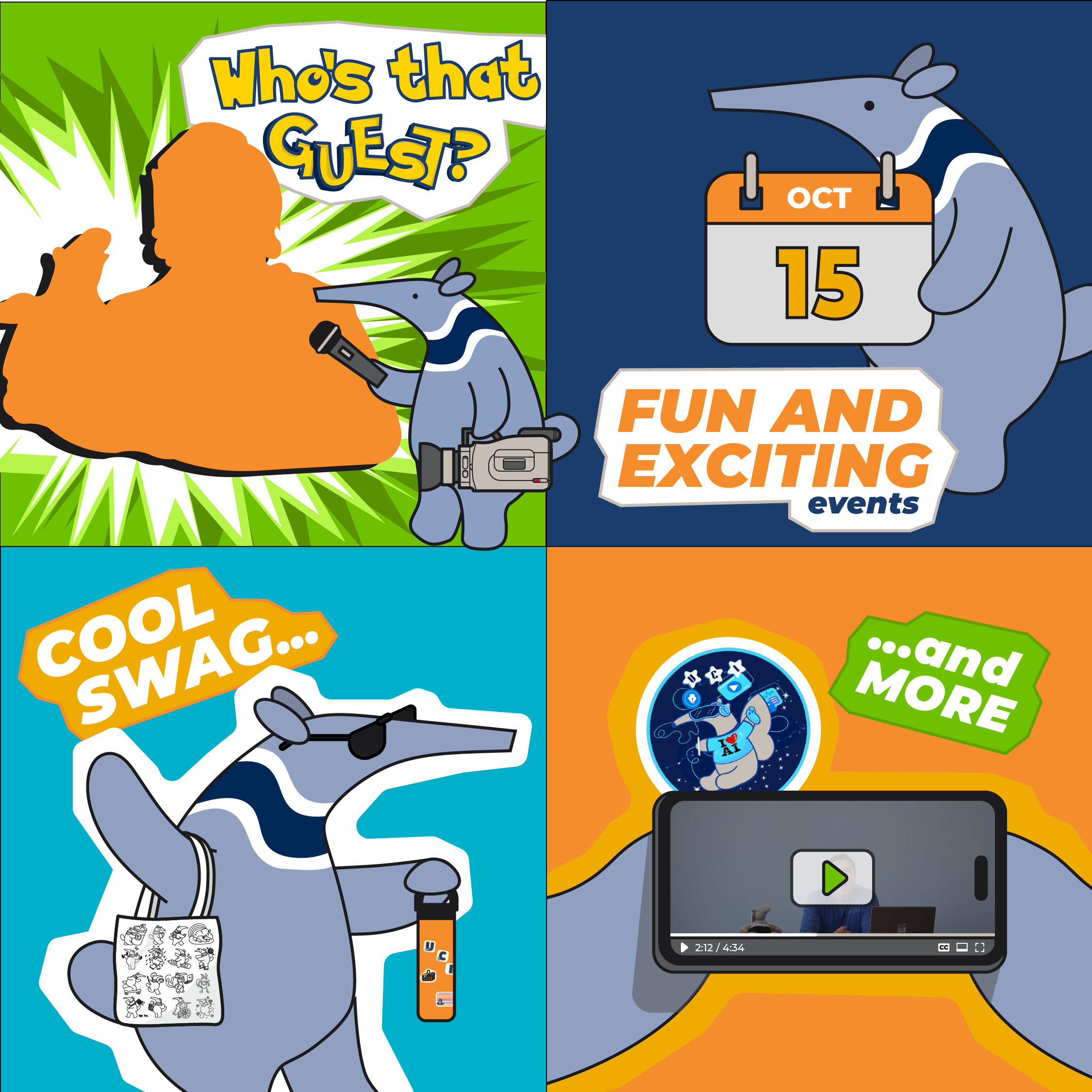
Every fall quarter at UC Irvine kicks off with the exciting Anteater Involvement Fair, where students stroll around in sweltering heat to learn about campus clubs and organizations.
The heat and chaos can be unappealing, but UC Irvine's OIT knows that free merch makes it all worth it.
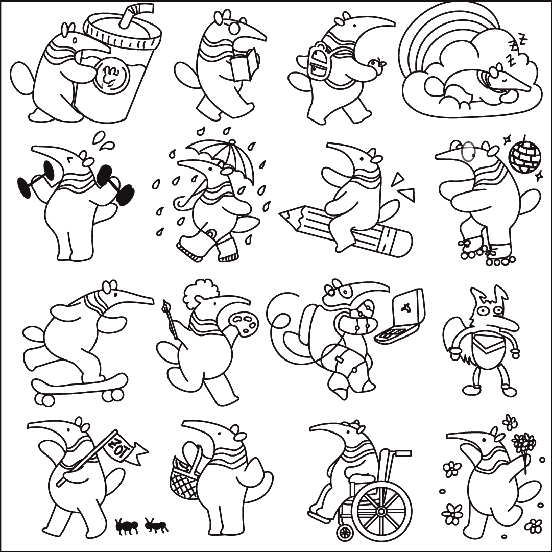
I designed a sticker sheet (left), drew a Peter keychain illustration (center), and outlined our tote bag designs (right).
Students were quick to grab these goodies, and OIT was able to promote our ZotGPT campaign on campus.
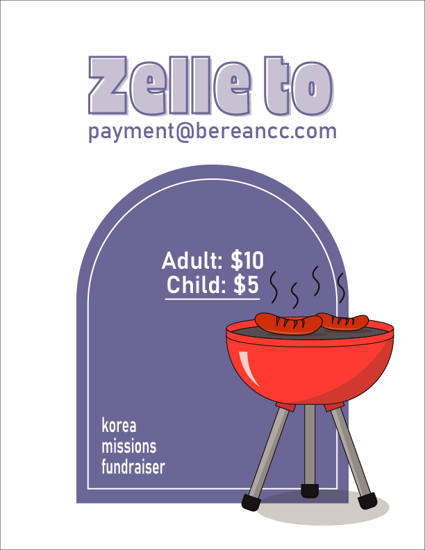
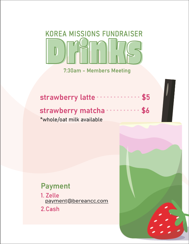
The Korea missions team at my church was hosting a lunch fundraiser, and they needed flyers that displayed important information to make the lines move fast.
It was my job to print menus that explained what's available, how much they cost, and how to pay. The graphic on the left was most important because a majority of the church would go through this line.
To help people get their food quicker, I applied principles of grouping and visual hierarchy to guide viewer's eyes. The most essential information was how to pay, since this is often the bottleneck step of the process. For those who didn't know or forgot how much to pay, the
If I could go back in time, I would outline the latte drink illustration for consistency... Alas, mistakes are opportunities for improvement, and I've learned my lesson since then.


I explored the illustrative end of graphic design for these assignments. I wanted to capture the fun, energetic feel of a football tournament, and I wanted to display the formal, competitive nature of auctions.
For the former, I incorporated soft colors, sporty fonts, and minimal outlines. This naturally created a playful tone that would invite viewers to sign up for this fun event.
For the latter, I went the opposite route, and I added a bold outline to the illustration. This graphic didn't need much information, so I felt the simplicity made the bold font more impactful.


Numbers of after-event attendees were running low, possibly due to exam season. It was my mission to entice diligent students to take a study break after our campus ministry meetings and enjoy intentional conversations over some hearty food.
I incorporated actual pictures of the food and red/yellow (AKA "hungry colors") to entice their appetites.


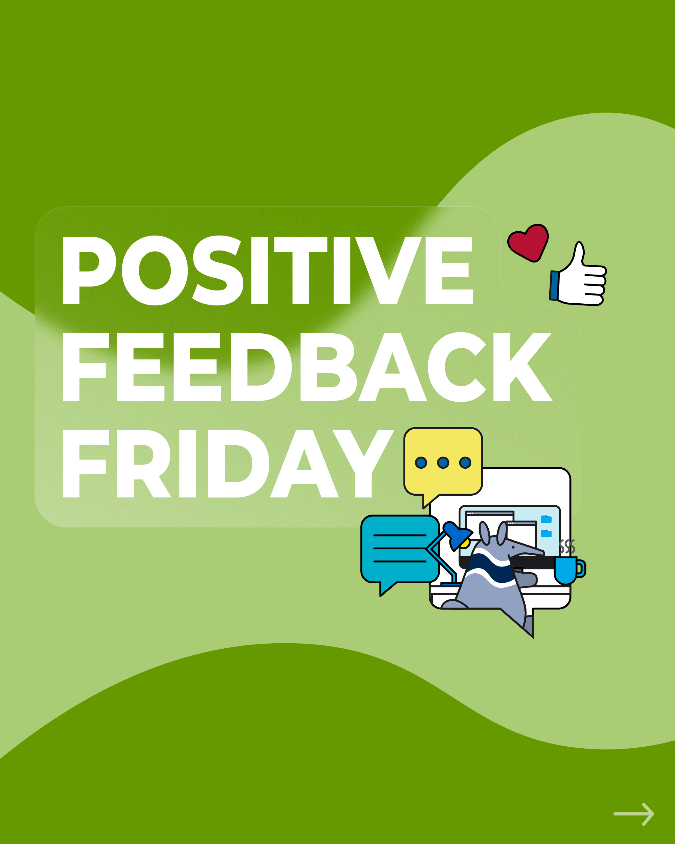
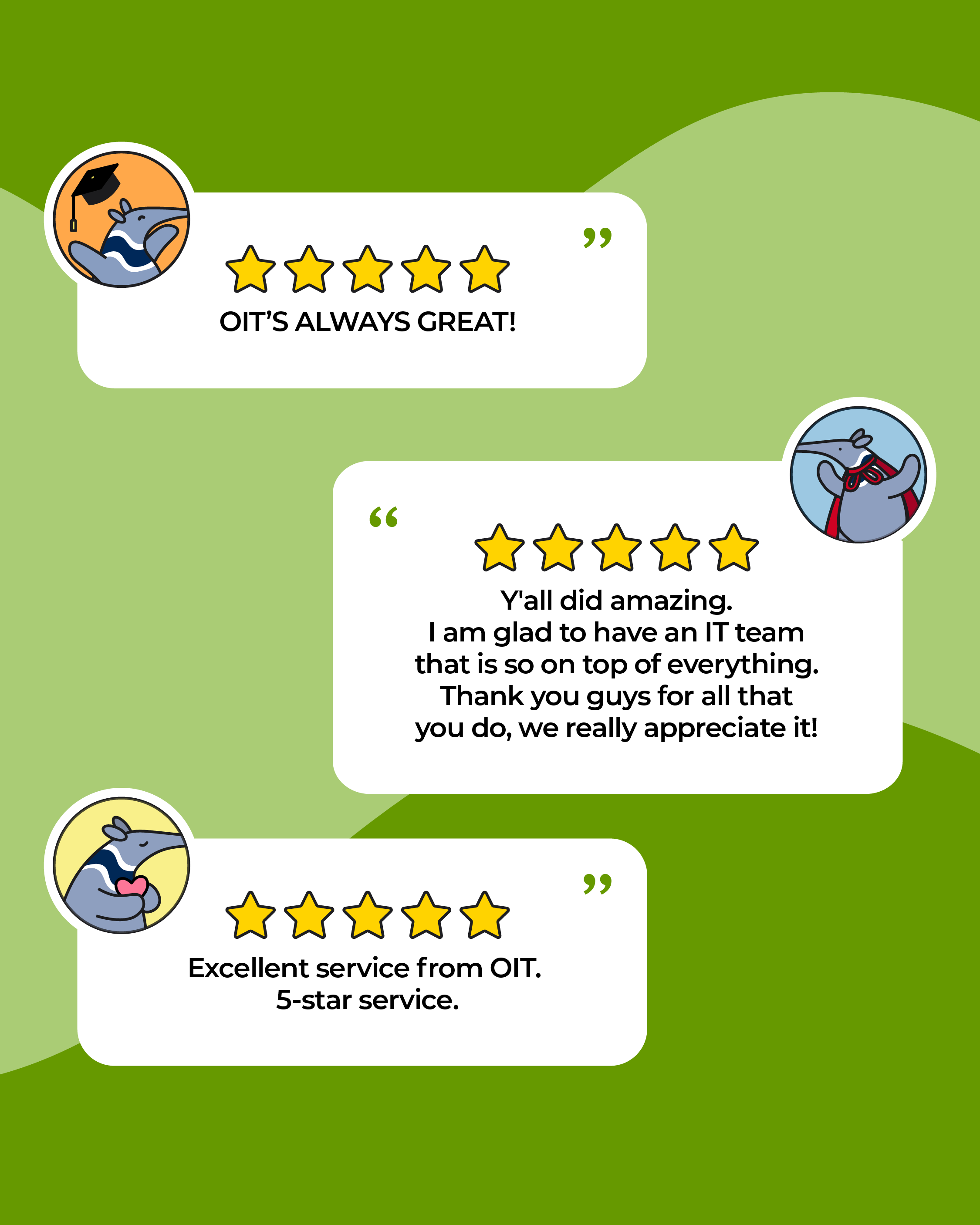
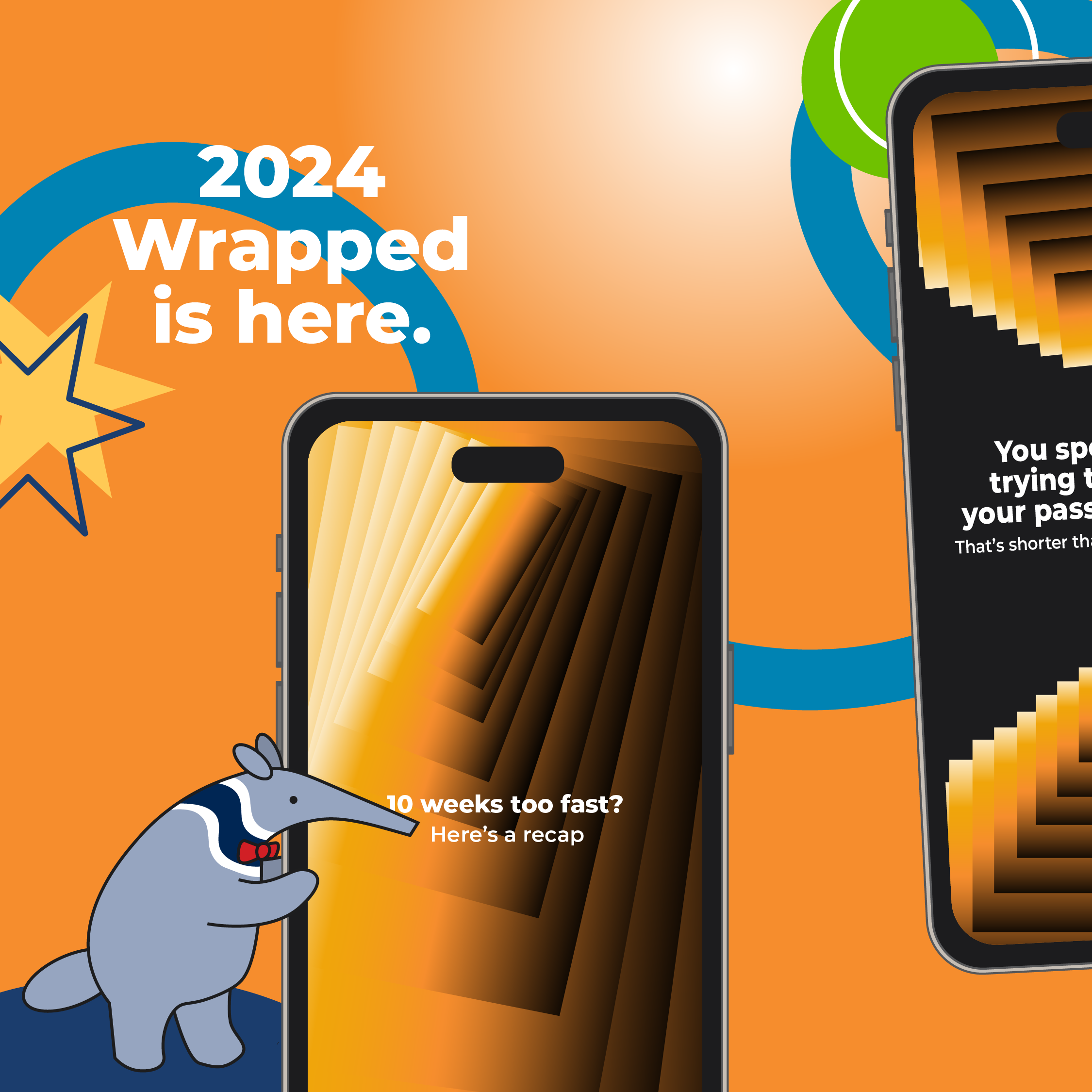
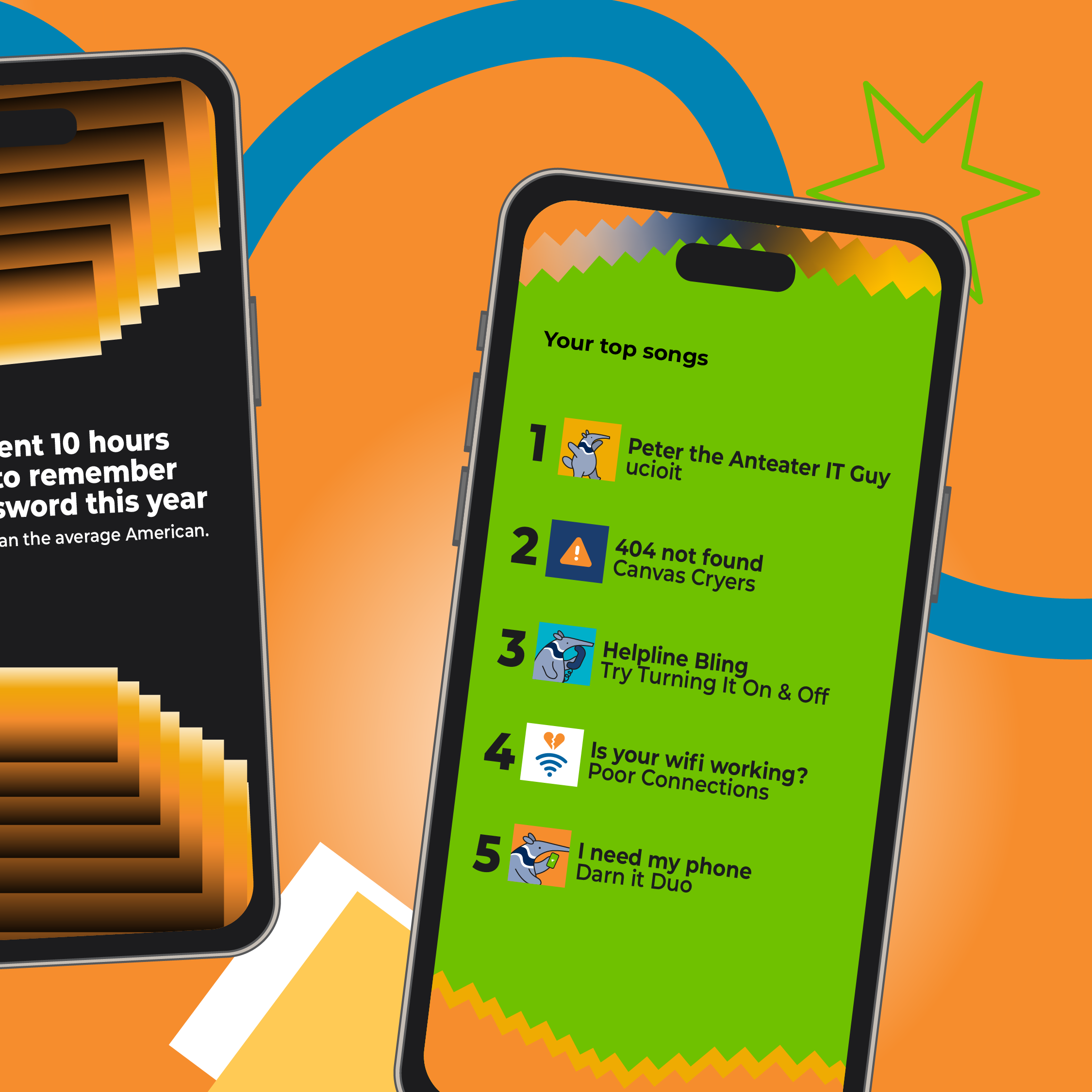
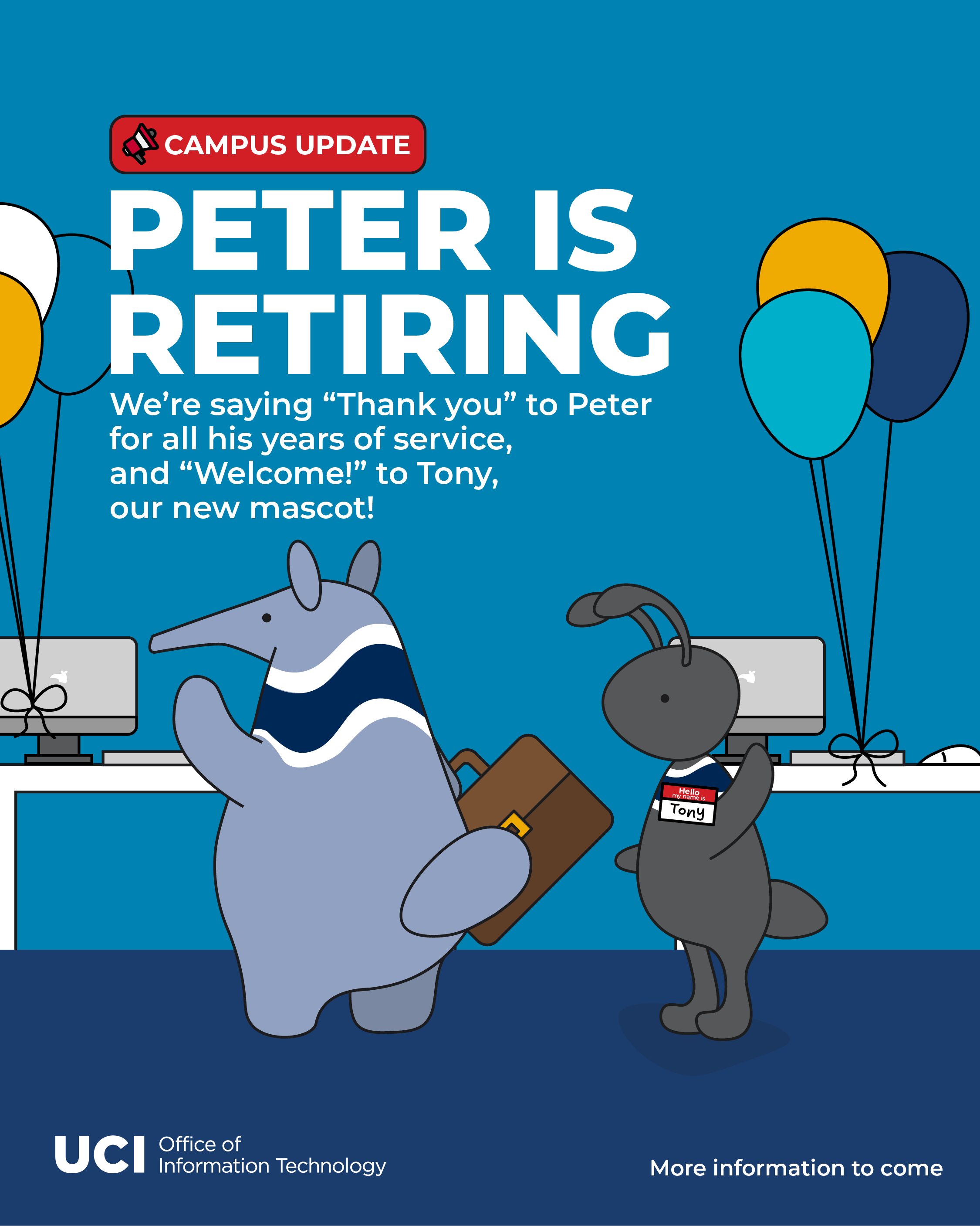
As UCI OIT's Student Marketing and Design Assistant, I created content for our social media platforms. These posts were meant to engage and inform our followers so that students, faculty, and staff can get involved on UC campus.
With so many resources available to our UCI family, we wanted to make sure we spread the news to everyone.


With my background in Human-Computer Interaction, I am passionate design that makes sense. This means I prioritize the users (or in this case, the viewers) and their experience with what I create.
Some campaigns contained an overwhelming amount of information to share.
My job was to design the layout that communicates important details without compromising on the main message.
One of the biggest challenges I faced was how to express creative freedom when constrained to strict branding guidelines.
After sharpening skills for information architecture, color theory, and illustration, I grew more comfortable with experimenting. I no longer shied away from the exciting, and I learned how to maintain my personal design identity under the guidance of the senior graphic designer.
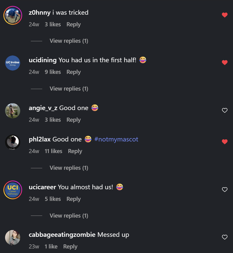
The update graphic (top left) was OIT's April Fool's post, and I was inspired by IHOP's legacy to fool our users.
I'd say it worked :)